
AERFLOW
Different airports. One familiar experience.
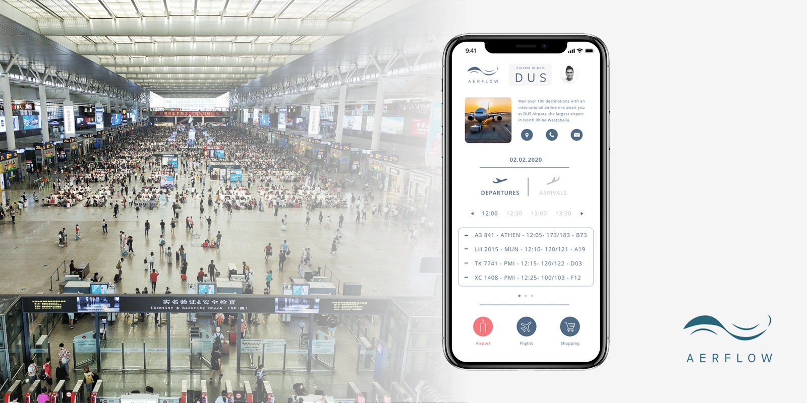
An airport companion concept designed to help travelers find their way, stay on top of their journey and move through unfamiliar places with greater confidence.
Role: Product & UI Design, Brand Identity
Platform: iOS
Project: Independent Concept
Focus: Information Architecture, Contextual UX
01. OVERVIEW
Aerflow began with a familiar experience: traveling through several airports on the way to a distant destination. The departure airport often felt manageable because I knew it well. But during a stopover, even simple questions could become stressful. Where can I find a pharmacy? How far away is my gate? Is that shop still open?
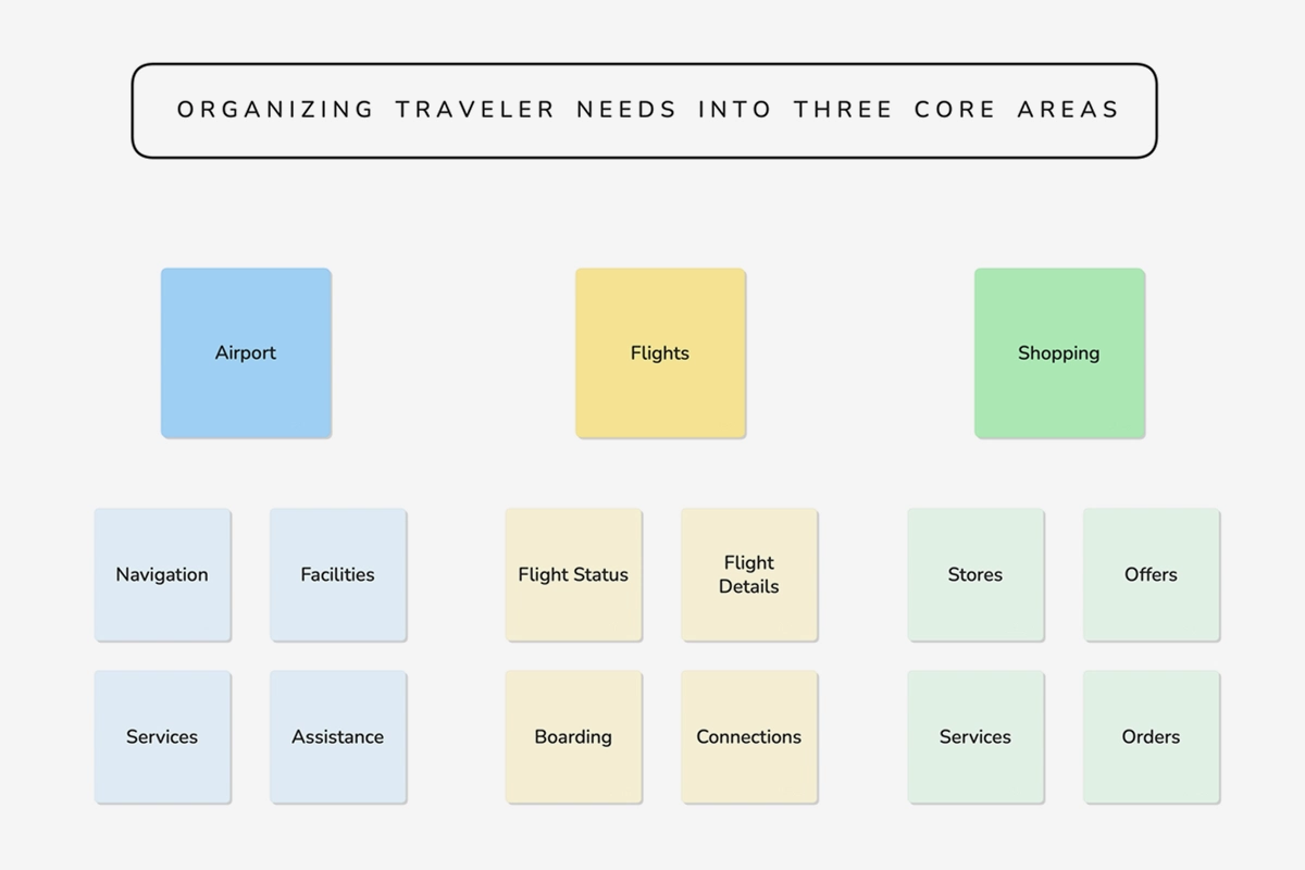
I imagined a single mobile experience that would make airport information accessible in a consistent way, regardless of where someone was traveling. The concept brings three areas together: Airport for orientation and services, Flights for personal journeys and Shopping for purchases and convenience.
I independently explored the product idea, user experience, interface design, name and visual identity, concentrating on representative screens rather than building a fully operational service.

02. THE PROBLEM
Familiar airports feel easier. Unfamiliar ones demand more effort.
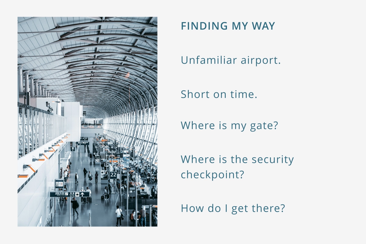
Frequent travel taught me how much familiarity matters. At an airport I know, I can anticipate where to go, which services are available and how much time I might need. At an unfamiliar airport, the same tasks require searching, interpreting signs, asking for help or learning a new airport website.
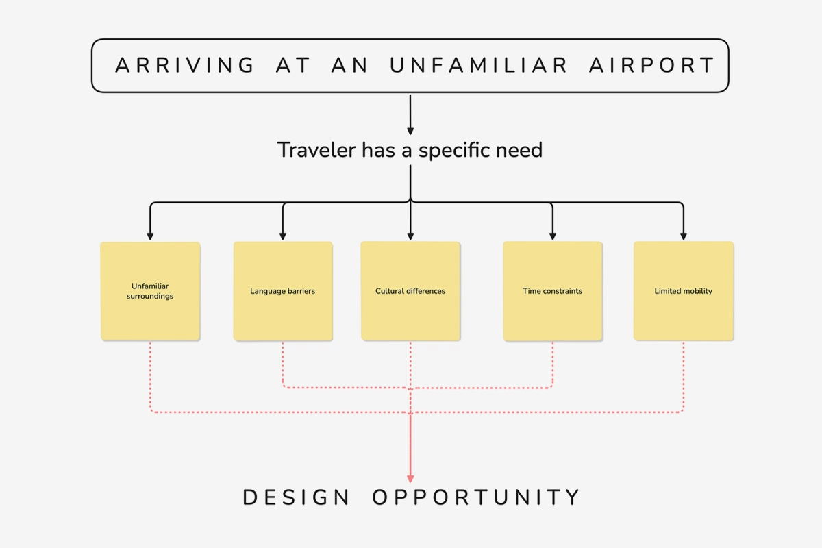
Information often exists, but it is scattered across signs, information desks, airport websites and airline apps. Time pressure, language barriers, unfamiliar layouts and opening hours can turn ordinary needs into stressful decisions. Searching for one thing can also mean losing track of something important, like a boarding time or gate change.
These observations came from my own travel experiences, not a formal user research study.
The design challenge
How might we give travelers one familiar way to navigate unfamiliar airports, access what they need and stay in control of their journey?


03. MY APPROACH
Bring the information to the traveler.
I started with two constants: travelers are at an airport, and many already carry a smartphone for boarding passes, communication and travel information. Instead of asking people to find and learn a different information system at each airport, I wanted the same interface to adapt to each location.
I considered airport Wi-Fi as a possible way to recognize the current airport, while manual airport selection could allow travelers to prepare for a future stopover. These were concept ideas, not validated detection mechanisms.
Structure information around three needs.
I organized the concept into Airport (orientation, arrivals, departures and services), Flights (personal itineraries and flight details) and Shopping (exploring products, purchases and potential pickup). Each area follows a progression from overview to detail, keeping secondary information out of the way until it becomes relevant.
I also kept the three main navigation destinations accessible across screens. This was a deliberate response to changing priorities: someone browsing shops might suddenly need to check their gate without navigating back through multiple levels.
Design calm within complexity.
The name Aerflow combines the idea of air with effortless movement. I wanted the interface to feel as clear and unhurried as the journey should feel: generous white space, simple controls, visible hierarchy and information as the focal point.
That principle extended to the brand campaign. Busy airport photography was paired with sparse, quiet messaging to contrast the complexity of the environment with the sense of calm Aerflow aimed to provide.
The guiding principle: Keep the experience familiar, the information relevant and the next action easy to reach.

04. THE SOLUTION
One interface, three connected parts of the journey.
Aerflow’s original screen designs show how the concept could work across airport orientation, personal travel information and shopping. They illustrate intended interactions, not live data connections or a functioning service.
A. Find your way around an airport
The Airport area uses the selected airport as its context. The designs include an airport overview, arrivals and departures, service categories and a floor-based terminal map. A larger map view gives navigation more room, with a position marker and directional indicator illustrating the intended experience.
The broader vision was to help people find a place and navigate toward it, whether they were traveling themselves or meeting someone at arrivals.
B. See the whole journey, not just the next flight
The Flights area explores travel as a connected itinerary rather than a series of isolated flights. A trip list leads to a timeline showing Düsseldorf, a stopover in Dubai and arrival in Bangkok, including departure and arrival times, gates and transfer time. Separate ticket views and a safety-information screen demonstrate deeper levels of detail.
I wanted travelers to understand what comes next while still being able to access the information needed right now. Live flight updates and airline integrations remained ideas for a future implementation.
C. Make airport time more useful
Shopping explored a more convenient way to discover airport products and potentially buy ahead for pickup. The wider idea included browsing by shop or brand, offers and services. A designed cart screen shows a product, total and proposed payment options.
Shopping was intended as an optional convenience layer, helping people spend less time searching and more time enjoying a stopover. Checkout, inventory availability and pickup partnerships were not implemented.
D. Switch context without losing control
The persistent bottom navigation makes the three areas accessible from different screens. Its purpose was not simply consistency. It was to let people switch quickly when circumstances change, such as needing flight information while exploring the airport.


05. REFLECTION
The concept remains relevant. The scope taught me where to stop.
Looking back, I still believe in Aerflow’s central idea: a consistent, portable experience that makes unfamiliar airports easier to understand. I also value the restrained visual language and the ability to switch directly between important areas. The campaign visuals still express the feeling I wanted the product to create.
At the same time, I would rethink parts of the information architecture today. Shopping could become a broader area for comfort and experiences. The deeper navigation levels need clearer structure, while typography, components and color could benefit from a more mature design system. I would also explore a more context-aware start screen and a better way to connect personal trips.
The biggest learning was about complexity beyond the interface. Reliable airport information, airline data, shop inventory and indoor navigation depend on external systems. A product like Aerflow would need to make uncertainty visible and provide useful alternatives when data is missing or outdated, for example by directing travelers to an airline app or an airport information desk. These are future design considerations, not completed features.
As the vision grew, I chose to stop at a representative design concept rather than imply I had solved every technical and operational dependency. That boundary helped me communicate the product’s value without presenting it as a finished service.
A simple experience takes more than a simple interface. It takes clear priorities, trustworthy information and knowing what not to build yet.