

BATO
Discover sushi through what you love.
A playful sushi ordering experience that helps people discover new favorites through familiar ingredients and order exactly what they want.
Role: Product & UI Design
Platform: iOS
Project: Independent Concept
Focus: Product Discovery, Interaction Design
01. OVERVIEW
BATO is an independent mobile sushi discovery and ordering concept designed to make choosing sushi more intuitive, personal, and enjoyable.
The idea emerged from an everyday observation: choosing unfamiliar sushi can be difficult when you don’t know what ingredients to expect, especially when predefined assortments include pieces you wouldn’t choose yourself. BATO offers a different starting point: discover varieties through ingredients you already enjoy, or browse sushi categories directly. From saving favorites to selecting individual pieces and quantities, the concept brings discovery and personal choice together in a playful delivery experience.
I independently developed the product idea, user experience, interface design, and visual identity.
02. THE PROBLEM
When choice isn’t really a choice.
The idea for BATO began with a simple observation: choosing sushi often means compromising.
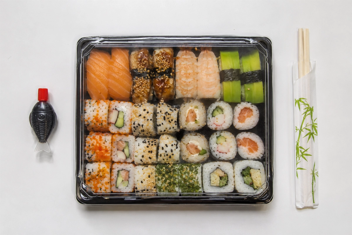
It started when my wife and I were shopping for sushi at a supermarket. While looking through the available boxes, I noticed something interesting: she wasn’t just avoiding pieces she didn’t like. She was also hesitant to try unfamiliar varieties because she couldn’t tell what was inside them. Eventually, we found an assortment with some pieces she recognized and enjoyed.
The catch? I would have to eat the ones she didn’t want.
That small moment made me wonder: Why should choosing something as simple as sushi involve so much uncertainty and compromise? What if we could explore unfamiliar varieties with confidence, understand their ingredients, and create our own selection based on what we actually like?
Predefined assortments make decisions for us. We might recognize a few pieces we enjoy while others remain unfamiliar or contain ingredients we dislike. Yet to get what we want, we may end up accepting the entire selection. At the same time, unfamiliar sushi can be difficult to judge by appearance or name alone. Without knowing what’s inside, people may stick to varieties they already know, overlooking options they might actually enjoy.
The challenge wasn’t to push people into trying something new. It was to reduce uncertainty and give them more control over what they choose.
The design challenge
How might we help people make confident sushi choices based on ingredients they know and love, without limiting them to predefined assortments?

03. MY APPROACH
Finding familiarity in the unfamiliar.
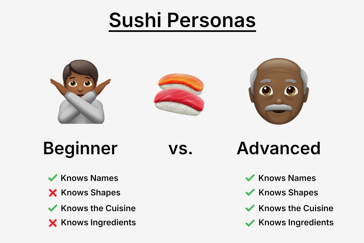
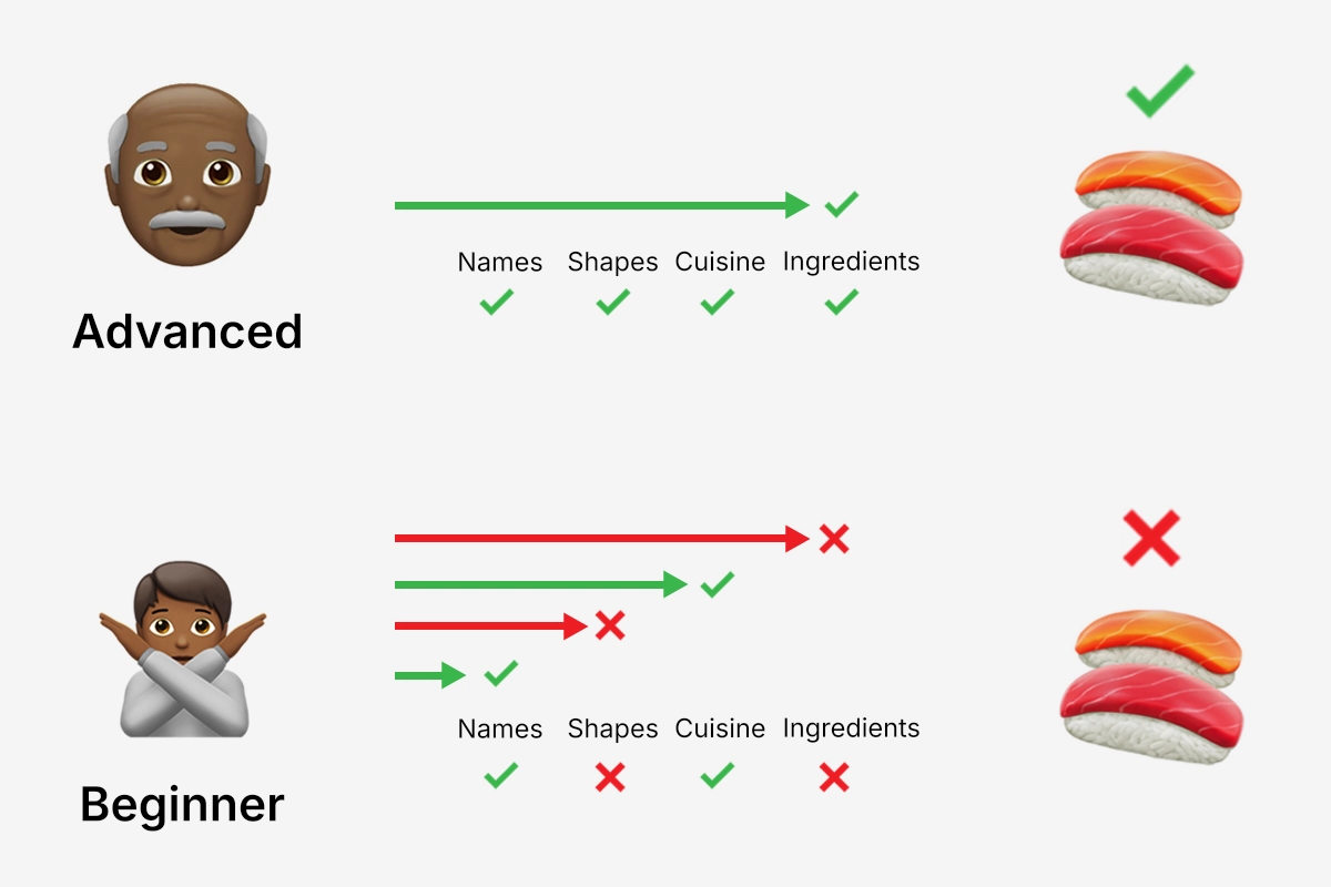
I explored different ways to help people make confident choices without requiring knowledge of Japanese cuisine or sushi terminology.
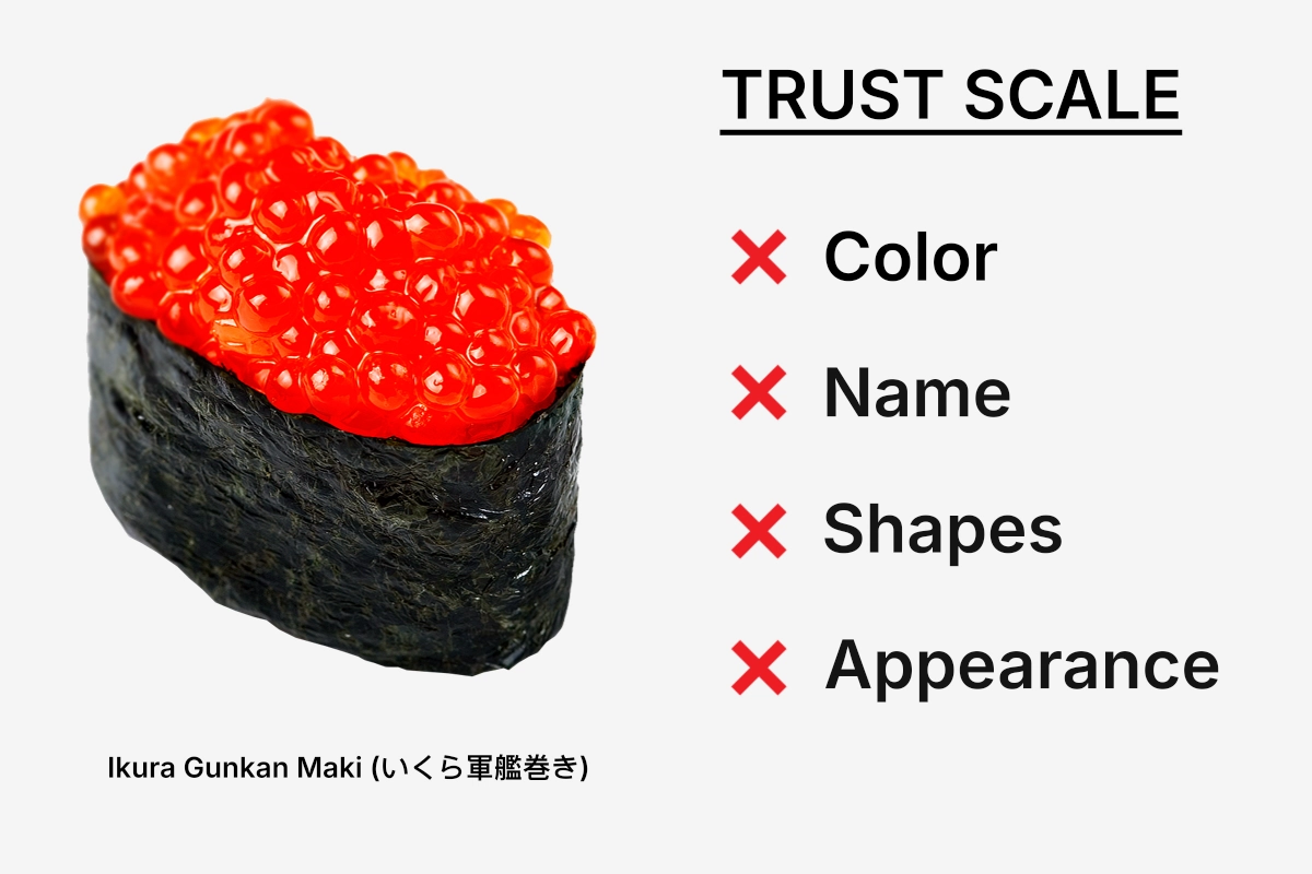
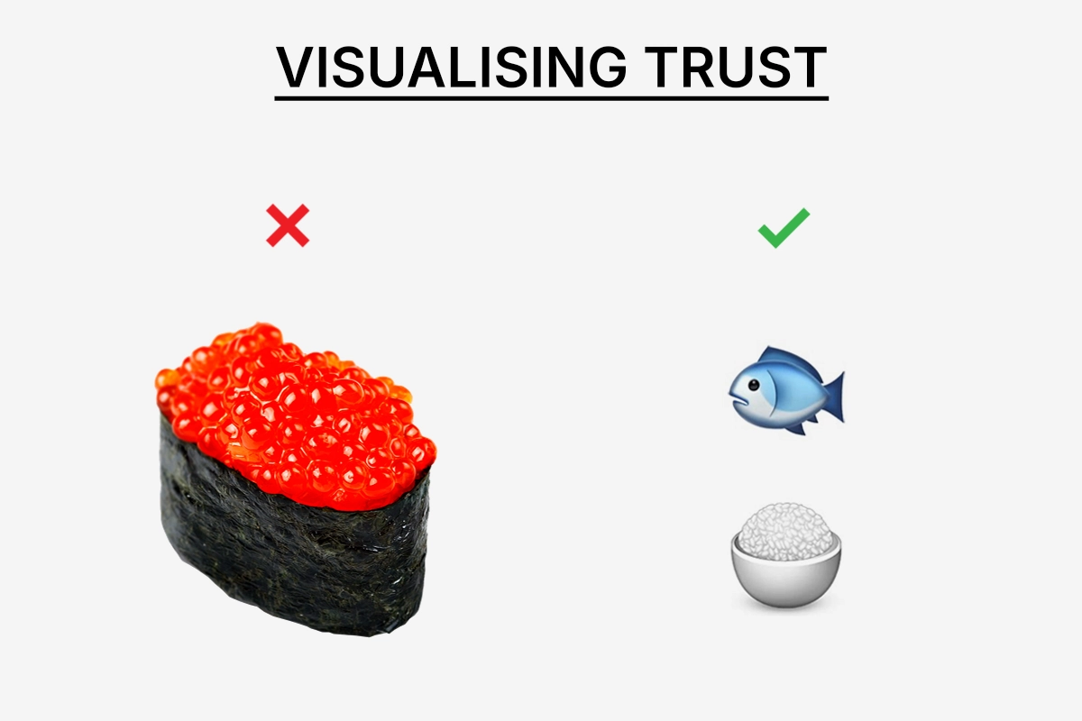
Names, shapes, colors, and appearance were possible starting points. But none consistently answered the question that mattered most: What’s actually inside? Ingredients offered a more familiar way to navigate the experience. Starting with foods people already know and enjoy could make unfamiliar sushi varieties feel more approachable.
Designing for different levels of familiarity.
I wanted BATO to accommodate different preferences: people looking for guidance through familiar ingredients and experienced sushi lovers who prefer browsing varieties directly. Both paths lead to the same principle: the freedom to select individual sushi varieties and quantities rather than accept a predefined assortment.
Making the experience feel playful.
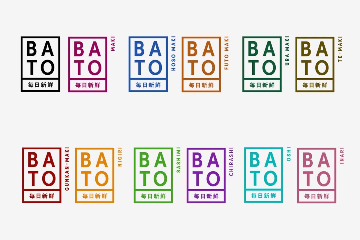
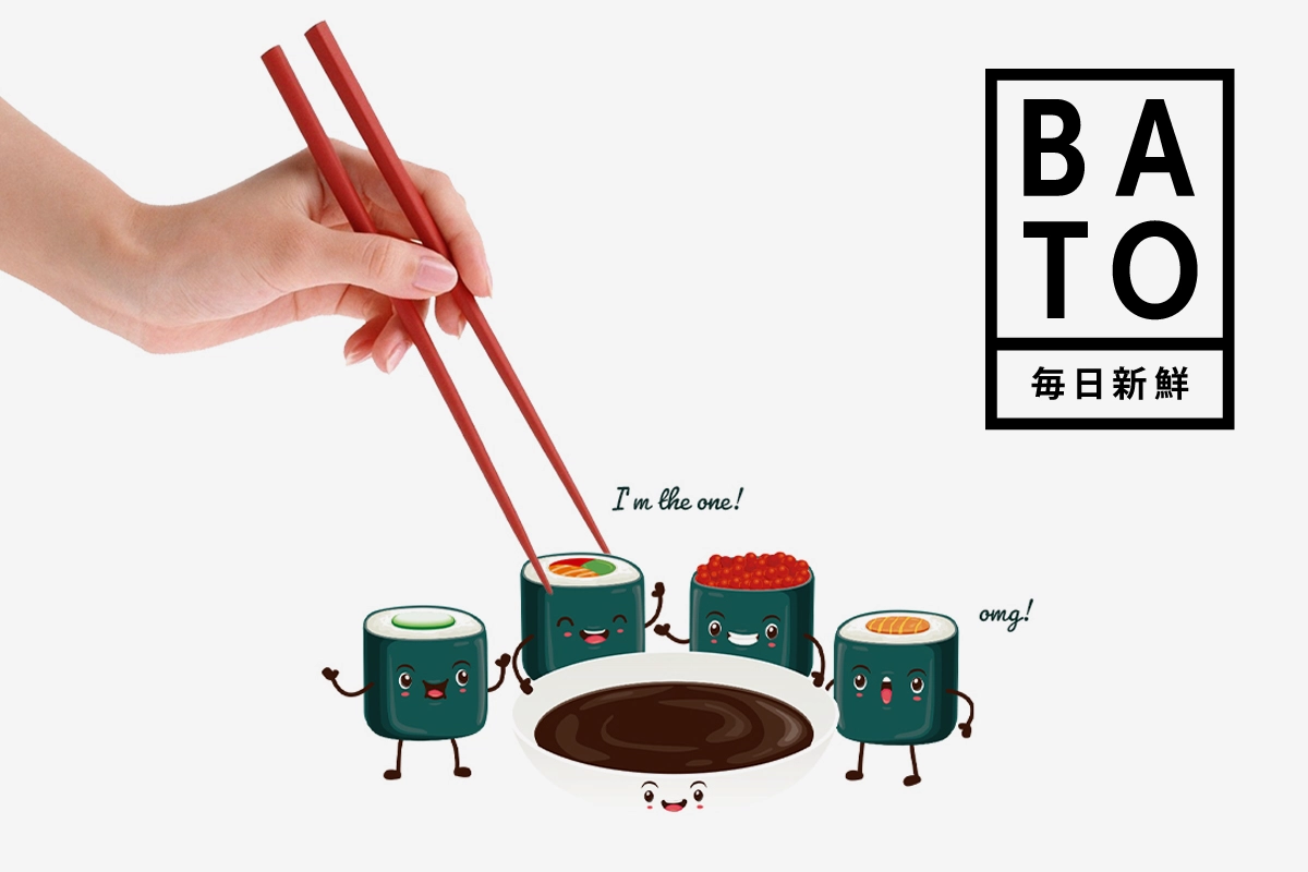
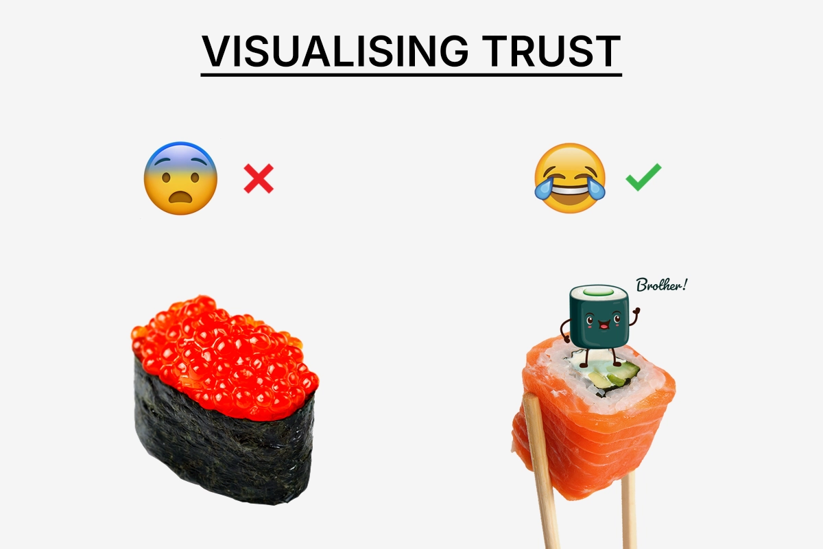
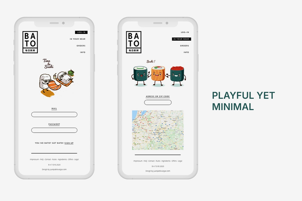
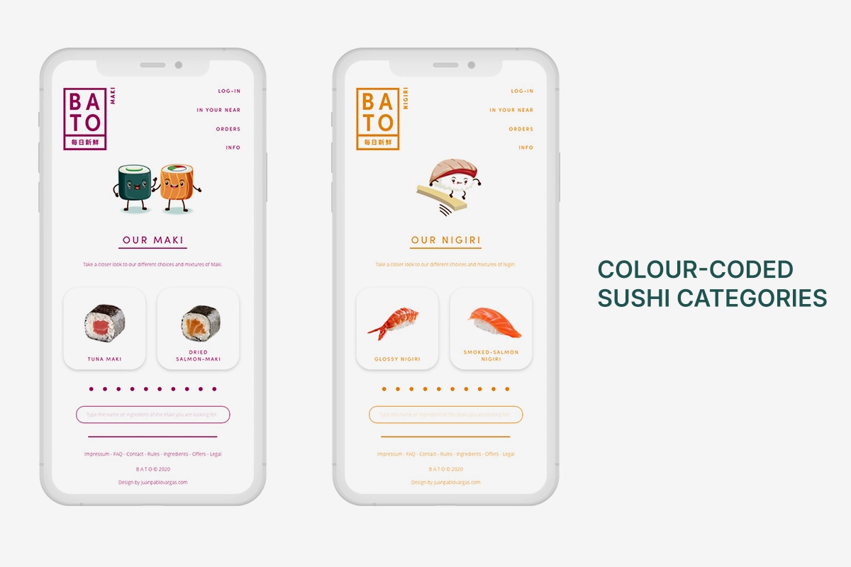
That thinking also informed the visual identity. Sushi is naturally playful: small, colorful, and enjoyed in different ways. I wanted BATO to reflect that character rather than reinforce the uncertainty of choosing unfamiliar food. Friendly sushi characters, vibrant colors, and a lighthearted visual language make exploration feel inviting.
The guiding principle: Build confidence through familiarity, flexibility through choice, and curiosity through playfulness.

04. THE SOLUTION
A more personal way to enjoy sushi.
BATO brings discovery, selection, and ordering together in one playful mobile app concept. Two ideas sit at its center: helping people feel confident about their choices and giving them control over exactly what they order.
A. Discover through ingredients
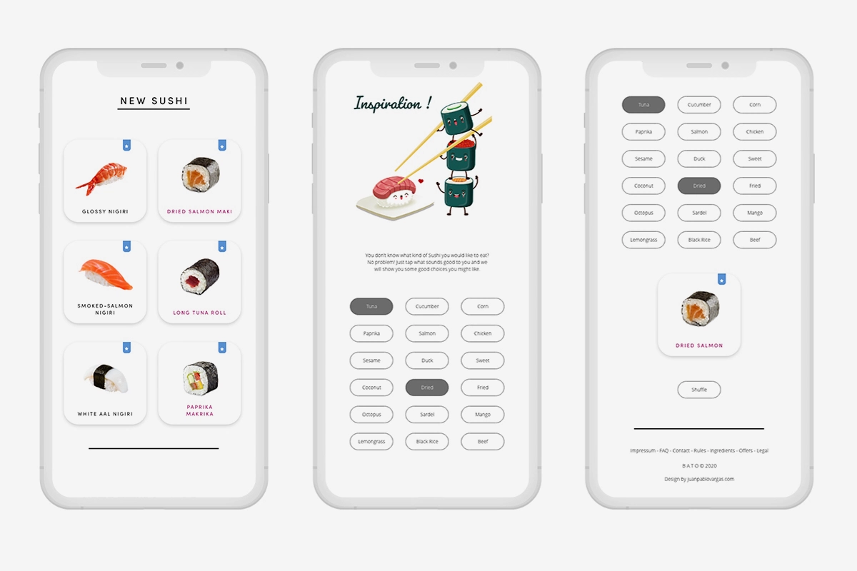
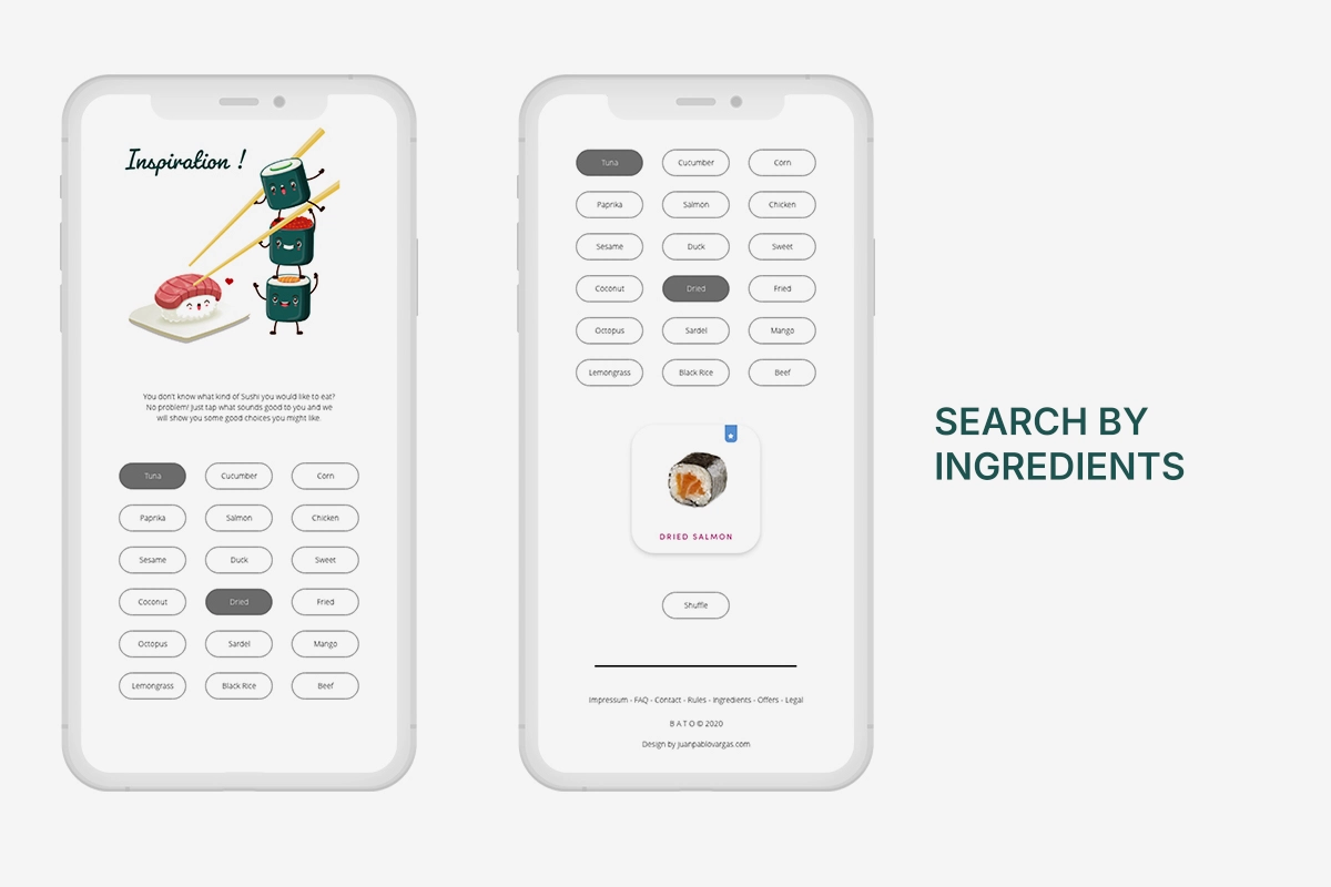
Instead of relying on unfamiliar names or appearances, users can select familiar ingredients and discover a corresponding sushi recommendation.
This ingredient-first approach aims to reduce uncertainty and make unfamiliar varieties more approachable.
B. Browse your way
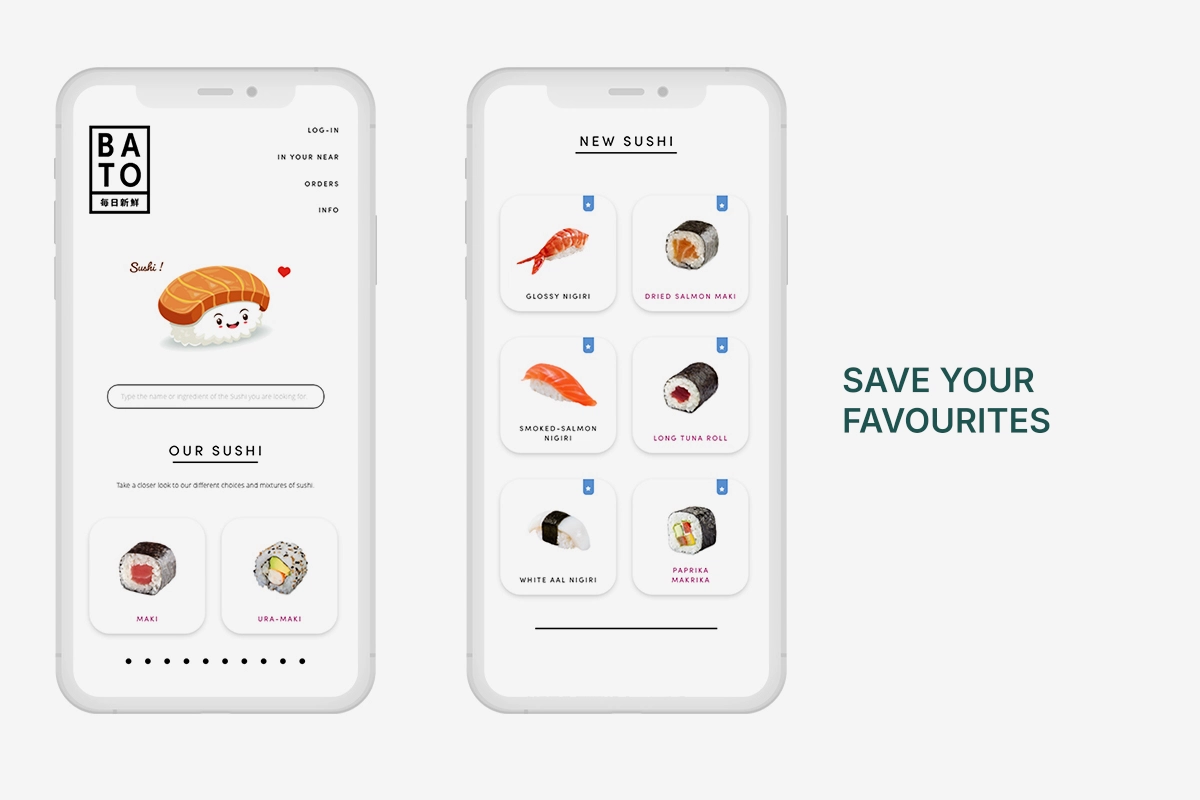
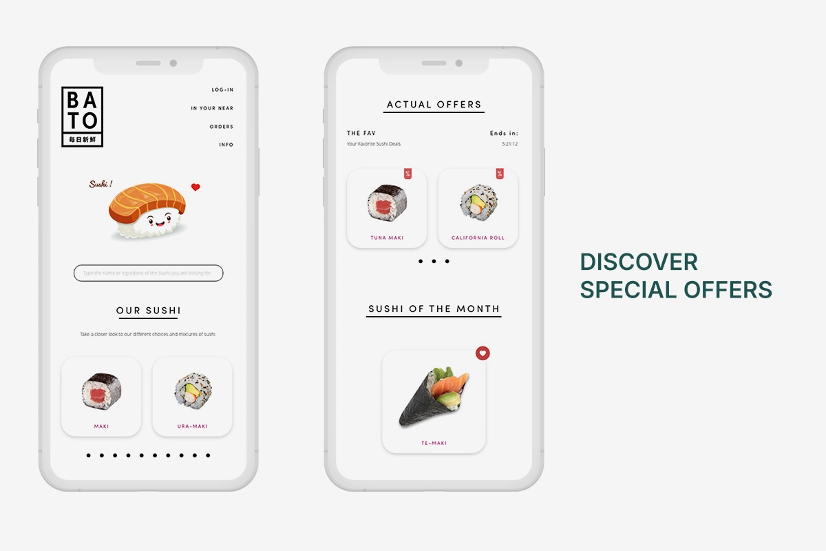
People familiar with sushi can explore categories such as Maki, Gunkan, and Onigiri. Favorites provide a quick way back to preferred varieties, while visual labels highlight new products and special offers.
The experience supports different levels of familiarity without forcing everyone through the same discovery path.
C. Choose exactly what you want
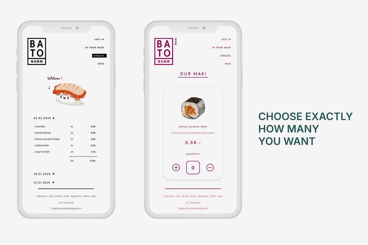
Instead of accepting a fixed assortment, users can select individual sushi varieties and adjust the quantity of each with a simple plus-and-minus control.
Whether it’s one piece or six of the same variety, the choice stays with the user.
D. Supporting the ordering experience
The wider concept includes featured sushi, special offers, account and payment settings, order information, and nearby BATO locations.
I concentrated the design exploration on discovery and selection, using familiar ordering conventions as the intended foundation for checkout rather than developing a detailed payment and delivery flow.
05. REFLECTION
The idea still holds up. The experience can evolve.
Looking back at BATO, I still believe in its core concept: making sushi easier to explore through familiar ingredients while giving people control over their choices. What I would approach differently today is how the interactions connect. The original ingredient discovery screen presented a single sushi recommendation. I would explore showing multiple matching varieties, depending on the selected ingredients, to give people a broader and more useful selection.
I would also reconsider the transition between discovering sushi, adjusting quantities, and building an order. Rather than making people repeatedly navigate back to choose another variety, I would explore a more continuous selection experience. The category structure, favorites, product labels, and playful visual identity still feel relevant to me.
A strong product idea doesn’t necessarily need to change, but the experience around it can always improve.
Looking back, BATO reminded me that good product design starts with understanding what people actually need, not simply adding more features or options. What began as a small frustration with choosing sushi became an opportunity to rethink how people discover and select food. For me, the most valuable part of this project was realizing how a simple change in perspective can make a familiar experience feel more intuitive and personal. Sometimes, the biggest improvement isn’t about creating something new, but finding a better way to do something we already know.