We build the future.
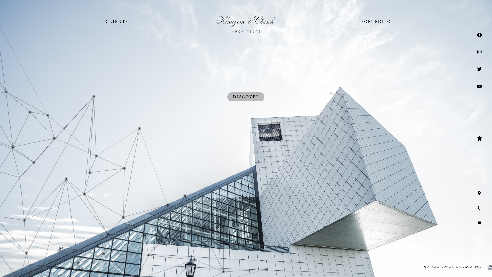
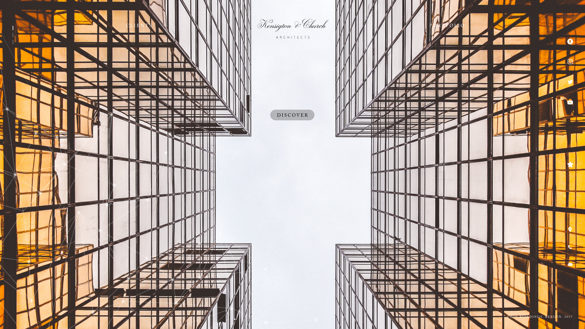
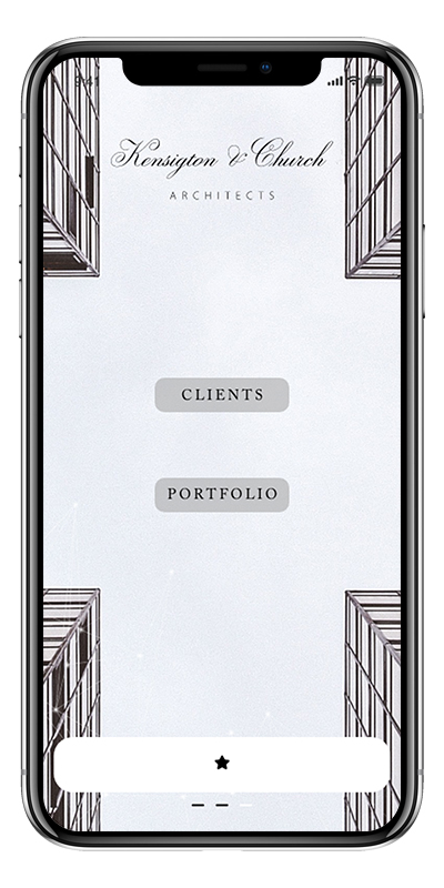
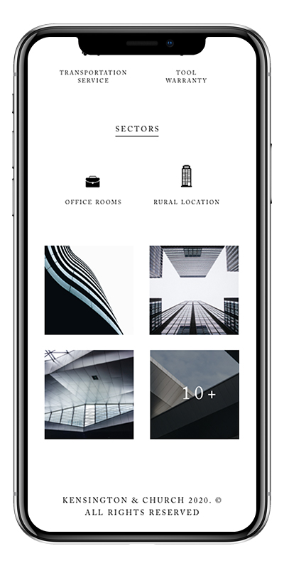
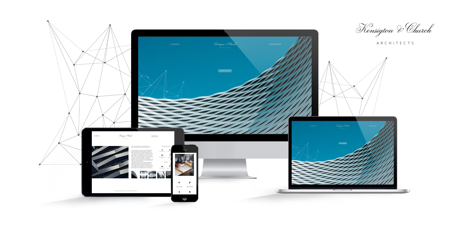
This would be the motto of the Kensington & Church concept, the idea of an architecture office. Kensington & Church is a clean and minimalist website created for a creative brand in the construction sector.
welcome the customers
Navigation made easy
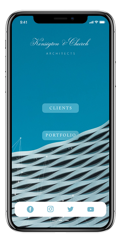
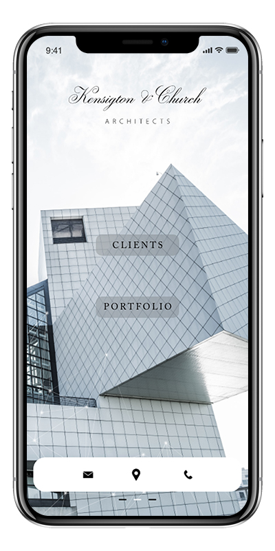
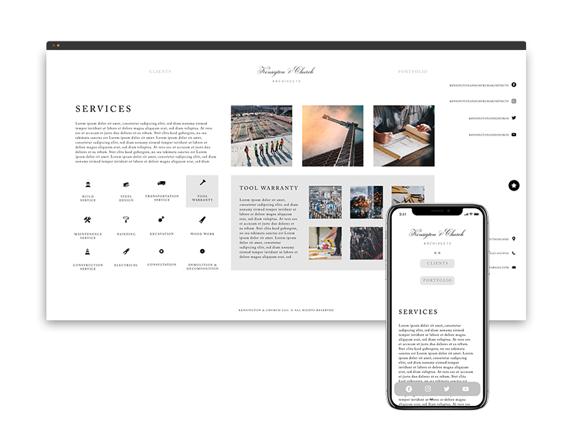
To navigate the site on mobile devices, you can simply swipe the bottom menu bar to reveal each of the available menu bars. 1. Social Profiles – 2. Contact Information – 3. Services

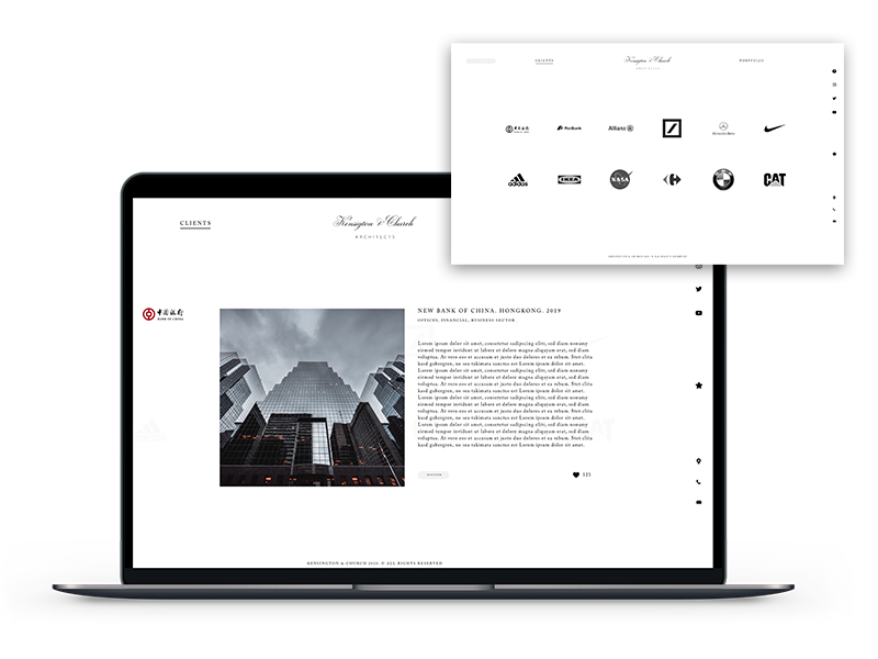
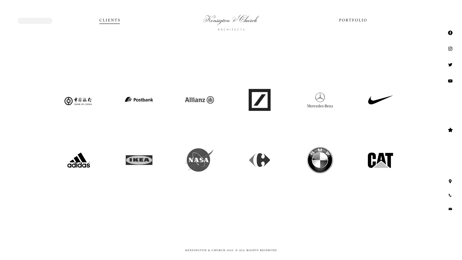
A name says more than thousand words
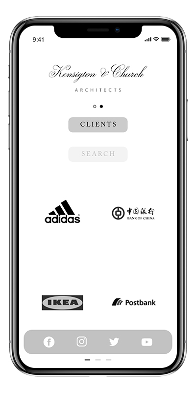
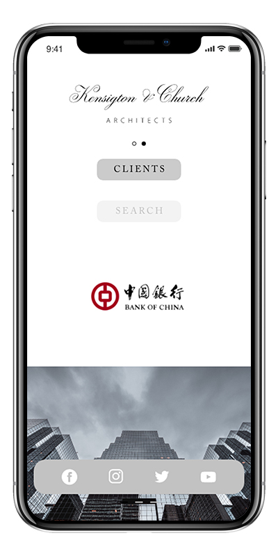
As an architecture firm, there is nothing more important than showing potential customers who is already a customer. If you select a client on the client page, you can immediately access every project implemented with it. The main website is divided into three large main sections. Customers, Portfolio and Services.

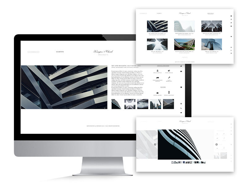
the work
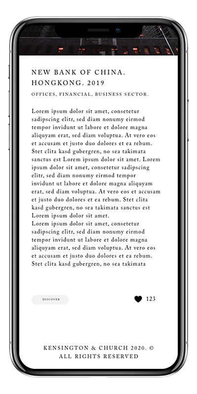
Showing the work done is as important as the work itself. For that reason the website has been designed so that the customer’s attention is not interrupted and they can focus on the topic they are looking for. As you look at a project, the entire project becomes a full landing page, with all of the details and images related.


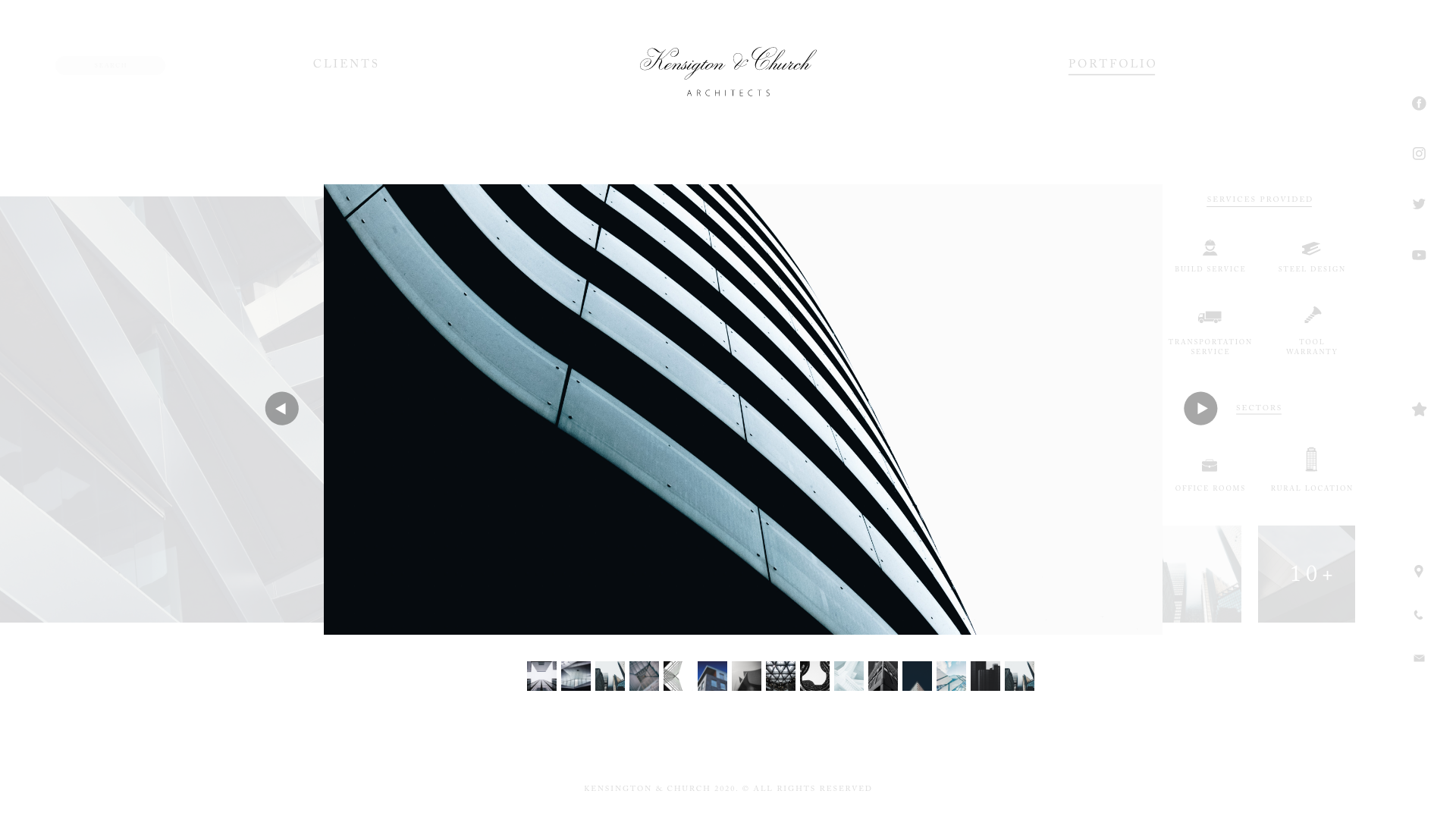
everything as good as done
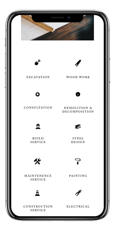
Kensington & Church not only offers the full service for building objects, but can also offer individual services if required. The customer has the opportunity to explore the various custom services that can even be prioritized if desired.


